ShopDreamUp AI ArtDreamUp
Deviation Actions
lately i've submitted multiple deviations that i've done to the bestofanimegirls group, at least the new ones, but each time i get declined. and i just don't get it. i know recently ive gotten better on the technical stuff, but still being declined? wtf?
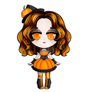
so this time I tried to submit this: soranisasayaku.deviantart.com/… to their chibi folder, but you guessed it, i got declined again. so i figured no more trying with not knowing! i simply just asked, "can you let me know why this was declined?", and this was the answer i got:
"Of course! This was a super close and tough decision to make! And unfortunately it was declined this time as we felt that although there are some wonderful qualities to your artwork submission, such as your amazing eye for drawing perfectly in proportion and your lovely imagination for character design, we felt that overall perhaps some of the shadows could be more deep and involved with the nature of the light/texture/material
For example the shadows on her hair seem a little bit blurry and although there certainly would be shadows running down each strand of the hair, perhaps also consider the horizontal ? And highlights on the hair too would be nice and really add an ambiance and sparkle to your already cute character!
We felt that the lineart was a little too thick, and although it did not matter on her hair, in closer drawn places, such as her hands, it looks not very elegant and clumpy, which is the opposite to the actual drawing of the character as she is very feminine and delicate!
In other parts the thick lineart also looked odd, was the blue top where her chin would be, perhaps if there was some form of shadow on the skin on top of this, it might make it look more connected ... but we feel the skin in general could use some more colour! I can see when squinting that there is a hint of this along her jawline, but perhaps if this was more dominant and maybe also a blush tint on her cheek, this would just help make the lineart less overpowering!
Overall we truly loved seeing your artwork despite the decline, and we can see that you are very talented so we hope that this does not put you off submitting in the future as I have no doubt we will be accepting soon!
many thanks
-yupon"
....um. ok thanks? i felt like this was more on stylistic choice. For example, i didn't want the shading to be "deep and involved" because that makes the image look more flat. and I did add highlights but for both of these things i wanted to make them subdued because that's just the style i like. i don't like horizontal highlights that much, also.
2nd) i like the thick lines. that's part of the style choice i made. and having a shadow so that the top part of the dress doesn't look awkward isn't possible since there isn't much space for that. the dress neck is ontop of the face, not the other way around.
3rd) there is not much space to make deep skin shadows on skin since there isn't much space to do that. again this is a style choice. does this (bestofanimegirls.deviantart.co…) have many skin shadows and more color? shouldn't this one bestofanimegirls.deviantart.co… have more skin shading and more color and more highlights and tint on the cheeks?
4th) i tried the cheek thing but i didn't like how it looked, because i didn't want her to look like she was blushing or wearing make-up.
plus this is the only thing they point out, regarding on what they accept: bestofanimegirls.deviantart.co…
i guess i'm just frustrated because i felt they were being too picky compared to some of their other deviations which i know my work is better.
i appreciate that my question was answered, but if their workstaff is being that picky then its time for me to look for another group that accepts different stylistic choices. just like in the anime/manga genre, not all manga styles look the same.
and that's that.
CS6
Thanks to one of my awesome friends, I now have CS6 adobe master collection. I had some issues with the CS5 that i had because I um ehem . . . . . did not pay for it. . .and ehem . . . .had an illegal version.
But no worries. I now have an even newer version of adobe.
I'll be able to work around photoshop a little easier now, and with a bitter ram and hard drive it should work much faster. I also saved my older hard disk so I can always save stuff in there too. I never actually save files in my laptop. Files are too big and I don't have to fill my laptop with them hence they are saved in portable hard-disks. : 3
Anyway, also wa
Crapiti crap crap
so much crap to do!
i dont know how i manage to finish it all sometimes. . .
but i've decided to 'upgrade' my social life LVL
because this vagina-carrying-biatch needs some
excitement.
love? and crazy grama
have you met someone you felt so comfortable with? someone funny/interesting/has goals and does them/attractive/share similar interests?
i feel this way.
and the night before yesterday i felt AMAZING!
by amazing: there was nothing else i was thinking about during that time and afterwards. i loved the intimate time and meeting some of his friends.
there was one part i regret not doing because i got nervous, i hope that right time can come again before i leave and im not forgotten.
i want to make my feelings clear, but i also need to know if i am a 'fling' or something more. if a mate wants a fling, he can look somewhere else for that.
Journal Views, Criticism, and deleted contact
1) journal views
i just realized that i have more journal views than actual art views?
that doesn't make sense.
is what i write more interesting than what I draw?
i mean do i really do that much of a shitty job in my drawings?
or are people just lazy to click the "view gallery" link?
so just wanted to point that out.
i mean i realize that i don't have many views for my deviations,
but i also think i don't completely submit shit in DA....
2) criticism
today in animation class, we pitched our beat boards. of course it's
affected me. i would be lying if i had said some shit like, "you're
annoying as hell, but i dont let your words g
© 2013 - 2024 SoraniSasayaku
Comments0
Join the community to add your comment. Already a deviant? Log In